
Raycast
Dark Tech Minimalism
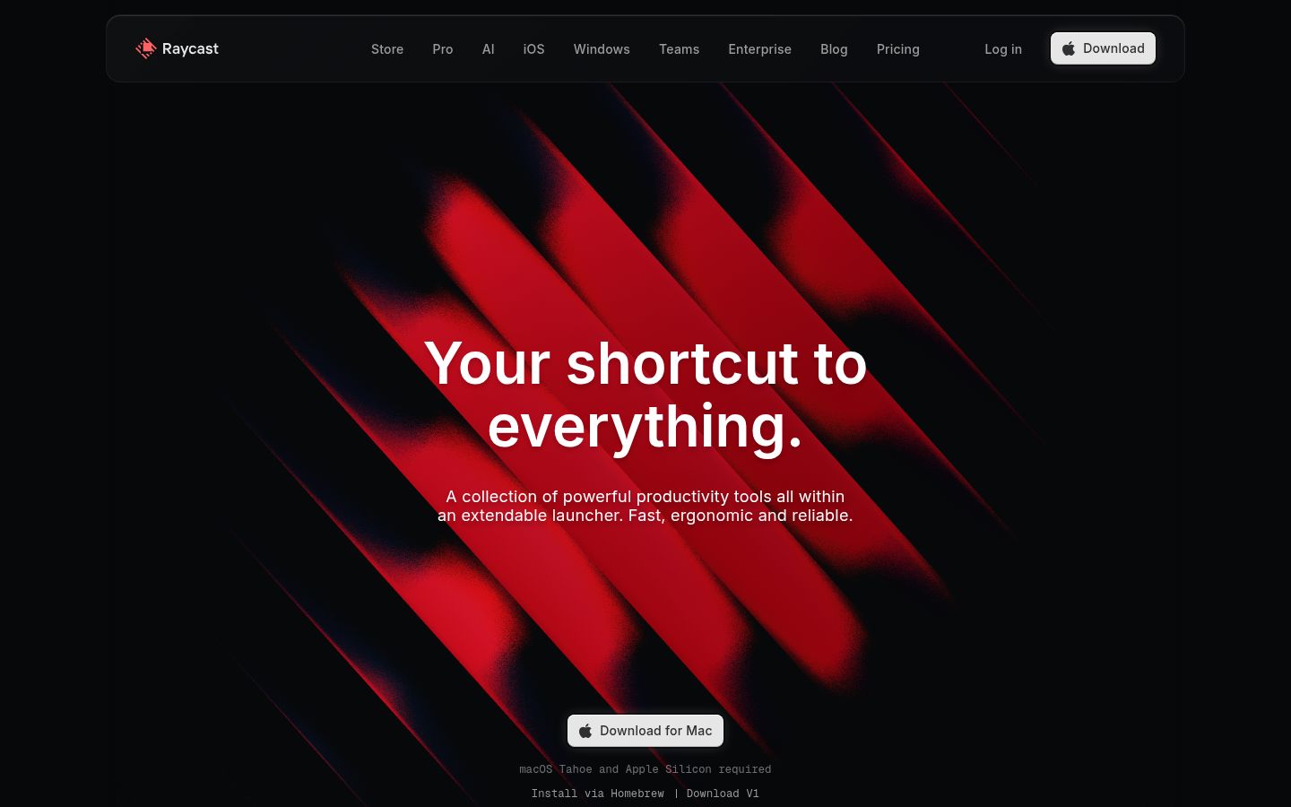
Raycast's design exudes a dark, tech-savvy minimalism, with a predominantly dark palette (#07080a, #000000) and accents of #9dbad8, #ff6363, and #59d499. The Inter font family is used for most text, with weights ranging from 350 to 600. The layout features a comfortable density, with a maximum width of 1204px and element gaps of 12px, creating a sense of depth and balance. The grid system is based on a 2-column layout, with card padding of 15px and radius of 11px.
Warna
Tipografi
Inter / SF Pro Text / Apple Color Emoji
| Peran | Ukuran | Berat | Line | Tracking |
|---|---|---|---|---|
| body-lg | 41px | 400 | 1 | normal |
| body-lg-20 | 20px | 500 | normal | 0.2px |
| display | 20px | 500 | normal | 0.2px |
| body-lg-18 | 18px | 350 | 1.78 | normal |
| body-lg-18 | 18px | 400 | normal | 0.2px |
| body | 16px | 500 | 1.6 | 0.2px |
| body-16 | 16px | 500 | 1.15 | normal |
| caption | 13px | 400 | 1.8 | normal |
| eyebrow | 12px | 400 | 1.33 | normal |
| eyebrow-11 | 11px | 400 | 1.09 | normal |
Bentuk dan jarak
Grid 1, 2, 4, 6, 8, 10, 12, 14, 15, 16, 24, 32, 40, 48 px · kerapatan comfortable · radius button 8px, card 11px, image penuh, pills penuh
# Raycast — Style Reference
> Dark Tech Minimalism

**Theme:** dark

Source measurements are normalized; roles and recommendations are interpreted. Font summary lists are independent, not paired by position.

Raycast's design exudes a dark, tech-savvy minimalism, with a predominantly dark palette (#07080a, #000000) and accents of #9dbad8, #ff6363, and #59d499. The Inter font family is used for most text, with weights ranging from 350 to 600. The layout features a comfortable density, with a maximum width of 1204px and element gaps of 12px, creating a sense of depth and balance. The grid system is based on a 2-column layout, with card padding of 15px and radius of 11px.

https://raycast.com

## Tokens — Colors

| Name | Value | Token | Role |
|------|-------|-------|------|
| Dusk | `#9dbad8` | `--color-dusk` | Used as an accent color in the background fill, shared by 8% |
| Ember | `#ff6363` | `--color-ember` | Used as an accent color in the background fill, shared by 0% |
| Sage | `#59d499` | `--color-sage` | Used as an accent color in the background fill, shared by 0% |
| Onyx | `#452324` | `--color-onyx` | Used as an accent color in the background fill, shared by 0% |
| Shadow | `#130d0e` | `--color-shadow` | Used as an accent color in the background fill, shared by 0% |
| Navy | `#07080a` | `--color-navy` | Used as a page canvas color, shared by 23% |
| Snow | `#ffffff` | `--color-snow` | Used as a text color, shared by 31% |
| Fog | `#e6e6e6` | `--color-fog` | Used as a button fill color, shared by 0% |
| Slate | `#9c9c9d` | `--color-slate` | Used as a text color, shared by 2% |
| Mist | `#8c8c91` | `--color-mist` | Used as a border and divider color, shared by 3% |
| Charcoal | `#6a6b6c` | `--color-charcoal` | Used as a text color, shared by 3% |
| Raven | `#434345` | `--color-raven` | Used as a border and divider color, shared by 3% |
| Ink | `#2f3031` | `--color-ink` | Used as a text color, shared by 14% |
| Obsidian | `#000000` | `--color-obsidian` | Used as a background fill color, shared by 11% |
| Gradient 1 | `radial-gradient(75% 75% at 50% 91.9%, rgb(18, 18, 18) 0%, rgb(13, 13, 13) 100%)` | `--color-gradient-1` | Decorative gradient accent |
| Gradient 2 | `linear-gradient(rgba(255, 255, 255, 0.15), rgba(255, 255, 255, 0.12) 20%, rgba(255, 255, 255, 0.12) 80%, rgba(255, 255, 255, 0.15))` | `--color-gradient-2` | Decorative gradient accent |

## Tokens — Typography

### Inter · `--font-inter`
- **Substitute:** Inter Fallback
- **Weights:** 350, 400, 500, 600
- **Sizes:** 11, 12, 13, 14, 16, 18, 20, 64
- **Line height:** 1.8, 1.33, normal, 1.78
- **Letter spacing:** 0.2px at 20px, 0.2px at 20px, 0.2px at 18px
- **OpenType features:** `"calt", "kern", "liga", "ss03"`
- **Role:** The Inter font family plays a primary role in Raycast's design, used for body text, headings, and buttons, with weights ranging from 350 to 600 and tracking of 0.2px. It provides a clean, modern look and feel, with excellent legibility.

### SF Pro Text · `--font-sf-pro-text`
- **Substitute:** SF Pro Icons
- **Weights:** 500, 700
- **Sizes:** 16, 23.8, 24, 32
- **Line height:** 1.15
- **Letter spacing:** normal
- **OpenType features:** `"calt", "kern", "liga", "ss03"`

### Apple Color Emoji · `--font-apple-color-emoji`
- **Substitute:** Segoe UI Emoji
- **Weights:** 400
- **Sizes:** 41, 112
- **Line height:** 1
- **Letter spacing:** normal
- **OpenType features:** `"calt", "kern", "liga", "ss03"`

### Type Scale

| Role | Family | Weight | Size | Line Height | Letter Spacing | Token |
|------|--------|--------|------|-------------|----------------|-------|
| body-lg | Apple Color Emoji | 400 | 41px | 1 | normal | `--text-body-lg` |
| body-lg-20 | Inter | 500 | 20px | normal | 0.2px | `--text-body-lg-20` |
| display | Inter | 500 | 20px | normal | 0.2px | `--text-display` |
| body-lg-18 | Inter | 350 | 18px | 1.78 | normal | `--text-body-lg-18` |
| body-lg-18 | Inter | 400 | 18px | normal | 0.2px | `--text-body-lg-18` |
| body | Inter | 500 | 16px | 1.6 | 0.2px | `--text-body` |
| body-16 | SF Pro Text | 500 | 16px | 1.15 | normal | `--text-body-16` |
| caption | Inter | 400 | 13px | 1.8 | normal | `--text-caption` |
| eyebrow | Inter | 400 | 12px | 1.33 | normal | `--text-eyebrow` |
| eyebrow-11 | Inter | 400 | 11px | 1.09 | normal | `--text-eyebrow-11` |

## Tokens — Spacing & Shapes

**Density:** comfortable

### Spacing Scale

| Name | Value | Token |
|------|-------|-------|
| 1 | 1px | `--spacing-1` |
| 2 | 2px | `--spacing-2` |
| 4 | 4px | `--spacing-4` |
| 6 | 6px | `--spacing-6` |
| 8 | 8px | `--spacing-8` |
| 10 | 10px | `--spacing-10` |
| 12 | 12px | `--spacing-12` |
| 14 | 14px | `--spacing-14` |
| 15 | 15px | `--spacing-15` |
| 16 | 16px | `--spacing-16` |
| 24 | 24px | `--spacing-24` |
| 32 | 32px | `--spacing-32` |
| 40 | 40px | `--spacing-40` |
| 48 | 48px | `--spacing-48` |

### Border Radius

| Element | Value |
|---------|-------|
| button | 8px |
| card | 11px |
| image | 9999px |
| pills | 9999px |

### Shadows

| Name | Value | Token |
|------|-------|-------|
| ui | `rgba(0, 0, 0, 0.4) 0px 1.5px 0.5px 2.5px, rgb(0, 0, 0) 0px 0px 0.5px 1px, rgba(0, 0, 0, 0.25) 0px 2px 1px 1px inset, rgb` | `--shadow-ui` |
| ui-2 | `rgba(255, 255, 255, 0.2) 0px 0px 0px 1px inset` | `--shadow-ui-2` |
| card | `rgba(0, 0, 0, 0.4) 0px 1.5px 0.5px 2.5px, rgb(0, 0, 0) 0px 0px 0.5px 1px, rgba(0, 0, 0, 0.25) 0px 2px 1px 1px inset, rgb` | `--shadow-card` |

### Layout

- **Page max-width:** 1204px
- **Card padding:** 15px
- **Element gap:** 12px
- **Common grid columns:** 2

## Do's and Don'ts

### Do
- Use a maximum width of 1204px for containers
- Set element gaps to 12px for a comfortable density
- Use the Inter font family with weights ranging from 350 to 600
- Set font sizes between 11px and 64px
- Use a radius of 8px for buttons and 11px for cards
- Set padding to 8px 12px for buttons and 15px for cards
- Use a tracking of 0.2px for text

### Don't
- Use colors not defined in the palette
- Use fonts other than Inter, SF Pro Text, and Apple Color Emoji
- Use radius or padding values not defined in the design system
- Use font sizes or weights not defined in the design system
- Use inconsistent spacing or density
- Use unnecessary shadows or gradients
- Use images or videos not optimized for web use

## Agent Prompt Guide

**Quick Color Reference**
- Background: #07080a
- Text: #ffffff
- Border: #8c8c91
- Accent: #9dbad8
# Raycast — Style Reference
> Dark Tech Minimalism

**Theme:** dark

Source measurements are normalized; roles and recommendations are interpreted. Font summary lists are independent, not paired by position.

Raycast's design exudes a dark, tech-savvy minimalism, with a predominantly dark palette (#07080a, #000000) and accents of #9dbad8, #ff6363, and #59d499. The Inter font family is used for most text, with weights ranging from 350 to 600. The layout features a comfortable density, with a maximum width of 1204px and element gaps of 12px, creating a sense of depth and balance. The grid system is based on a 2-column layout, with card padding of 15px and radius of 11px.

https://raycast.com

## Tokens — Colors

| Name | Value | Token | Role |
|------|-------|-------|------|
| Dusk | `#9dbad8` | `--color-dusk` | Used as an accent color in the background fill, shared by 8% |
| Ember | `#ff6363` | `--color-ember` | Used as an accent color in the background fill, shared by 0% |
| Sage | `#59d499` | `--color-sage` | Used as an accent color in the background fill, shared by 0% |
| Onyx | `#452324` | `--color-onyx` | Used as an accent color in the background fill, shared by 0% |
| Shadow | `#130d0e` | `--color-shadow` | Used as an accent color in the background fill, shared by 0% |
| Navy | `#07080a` | `--color-navy` | Used as a page canvas color, shared by 23% |
| Snow | `#ffffff` | `--color-snow` | Used as a text color, shared by 31% |
| Fog | `#e6e6e6` | `--color-fog` | Used as a button fill color, shared by 0% |
| Slate | `#9c9c9d` | `--color-slate` | Used as a text color, shared by 2% |
| Mist | `#8c8c91` | `--color-mist` | Used as a border and divider color, shared by 3% |
| Charcoal | `#6a6b6c` | `--color-charcoal` | Used as a text color, shared by 3% |
| Raven | `#434345` | `--color-raven` | Used as a border and divider color, shared by 3% |
| Ink | `#2f3031` | `--color-ink` | Used as a text color, shared by 14% |
| Obsidian | `#000000` | `--color-obsidian` | Used as a background fill color, shared by 11% |
| Gradient 1 | `radial-gradient(75% 75% at 50% 91.9%, rgb(18, 18, 18) 0%, rgb(13, 13, 13) 100%)` | `--color-gradient-1` | Decorative gradient accent |
| Gradient 2 | `linear-gradient(rgba(255, 255, 255, 0.15), rgba(255, 255, 255, 0.12) 20%, rgba(255, 255, 255, 0.12) 80%, rgba(255, 255, 255, 0.15))` | `--color-gradient-2` | Decorative gradient accent |

## Tokens — Typography

### Inter · `--font-inter`
- **Substitute:** Inter Fallback
- **Weights:** 350, 400, 500, 600
- **Sizes:** 11, 12, 13, 14, 16, 18, 20, 64
- **Line height:** 1.8, 1.33, normal, 1.78
- **Letter spacing:** 0.2px at 20px, 0.2px at 20px, 0.2px at 18px
- **OpenType features:** `"calt", "kern", "liga", "ss03"`
- **Role:** The Inter font family plays a primary role in Raycast's design, used for body text, headings, and buttons, with weights ranging from 350 to 600 and tracking of 0.2px. It provides a clean, modern look and feel, with excellent legibility.

### SF Pro Text · `--font-sf-pro-text`
- **Substitute:** SF Pro Icons
- **Weights:** 500, 700
- **Sizes:** 16, 23.8, 24, 32
- **Line height:** 1.15
- **Letter spacing:** normal
- **OpenType features:** `"calt", "kern", "liga", "ss03"`

### Apple Color Emoji · `--font-apple-color-emoji`
- **Substitute:** Segoe UI Emoji
- **Weights:** 400
- **Sizes:** 41, 112
- **Line height:** 1
- **Letter spacing:** normal
- **OpenType features:** `"calt", "kern", "liga", "ss03"`

### Type Scale

| Role | Family | Weight | Size | Line Height | Letter Spacing | Token |
|------|--------|--------|------|-------------|----------------|-------|
| body-lg | Apple Color Emoji | 400 | 41px | 1 | normal | `--text-body-lg` |
| body-lg-20 | Inter | 500 | 20px | normal | 0.2px | `--text-body-lg-20` |
| display | Inter | 500 | 20px | normal | 0.2px | `--text-display` |
| body-lg-18 | Inter | 350 | 18px | 1.78 | normal | `--text-body-lg-18` |
| body-lg-18 | Inter | 400 | 18px | normal | 0.2px | `--text-body-lg-18` |
| body | Inter | 500 | 16px | 1.6 | 0.2px | `--text-body` |
| body-16 | SF Pro Text | 500 | 16px | 1.15 | normal | `--text-body-16` |
| caption | Inter | 400 | 13px | 1.8 | normal | `--text-caption` |
| eyebrow | Inter | 400 | 12px | 1.33 | normal | `--text-eyebrow` |
| eyebrow-11 | Inter | 400 | 11px | 1.09 | normal | `--text-eyebrow-11` |

## Tokens — Spacing & Shapes

**Density:** comfortable

### Spacing Scale

| Name | Value | Token |
|------|-------|-------|
| 1 | 1px | `--spacing-1` |
| 2 | 2px | `--spacing-2` |
| 4 | 4px | `--spacing-4` |
| 6 | 6px | `--spacing-6` |
| 8 | 8px | `--spacing-8` |
| 10 | 10px | `--spacing-10` |
| 12 | 12px | `--spacing-12` |
| 14 | 14px | `--spacing-14` |
| 15 | 15px | `--spacing-15` |
| 16 | 16px | `--spacing-16` |
| 24 | 24px | `--spacing-24` |
| 32 | 32px | `--spacing-32` |
| 40 | 40px | `--spacing-40` |
| 48 | 48px | `--spacing-48` |

### Border Radius

| Element | Value |
|---------|-------|
| button | 8px |
| card | 11px |
| image | 9999px |
| pills | 9999px |

### Shadows

| Name | Value | Token |
|------|-------|-------|
| ui | `rgba(0, 0, 0, 0.4) 0px 1.5px 0.5px 2.5px, rgb(0, 0, 0) 0px 0px 0.5px 1px, rgba(0, 0, 0, 0.25) 0px 2px 1px 1px inset, rgb` | `--shadow-ui` |
| ui-2 | `rgba(255, 255, 255, 0.2) 0px 0px 0px 1px inset` | `--shadow-ui-2` |
| card | `rgba(0, 0, 0, 0.4) 0px 1.5px 0.5px 2.5px, rgb(0, 0, 0) 0px 0px 0.5px 1px, rgba(0, 0, 0, 0.25) 0px 2px 1px 1px inset, rgb` | `--shadow-card` |

### Layout

- **Page max-width:** 1204px
- **Card padding:** 15px
- **Element gap:** 12px
- **Common grid columns:** 2

## Components

### Primary Button
**Role:** Call-to-Action

The Primary Button features a background color of #e6e6e6, text color of #2f3031, and a radius of 8px, with padding of 8px 12px and font size of 14px/500. It is used for prominent actions, such as downloading the app.

_Measured: background #e6e6e6, text #2f3031, radius 8px, padding 8px 12px, font 14px/500, shadow rgba(0, 0, 0, 0.5) 0px 0px 0px 2px, rgba(255, 255, 255, 0.19) 0px 0px 14px 0px, rgba(0, 0, 0, 0.2) 0px -1px 0.4px 0px inset, rgb(255, 255, 255) 0px 1px 0.4px 0px inset_

### Button 2
**Role:** Action


_Measured: text #9c9c9d, radius 4px, padding 0px, font 12px/400_

### Card 1
**Role:** Content container


_Measured: background #000000, radius 19px, padding 8px, shadow rgba(255, 255, 255, 0.03) 0px 0px 40px 20px, rgba(255, 255, 255, 0.3) 0px 0.5px 0px 0px inset_

### Card 2
**Role:** Content container


_Measured: background #07080a, radius 12px, padding 0px, shadow rgba(255, 255, 255, 0.19) 0px 0px 2px 0px, rgba(255, 255, 255, 0.1) 0px 0.5px 0px 0px inset_

### Card 3
**Role:** Content container


_Measured: radius 26px, padding 0px, shadow rgba(0, 0, 0, 0.2) 0px 16px 48px 8px, rgba(0, 0, 0, 0.75) 0px 0px 0px 0.5px, rgba(0, 0, 0, 0.4) 0px 4px 8px 0px, rgba(0, 0, 0, 0.8) 0px 12px 32px 0px_

## Do's and Don'ts

### Do
- Use a maximum width of 1204px for containers
- Set element gaps to 12px for a comfortable density
- Use the Inter font family with weights ranging from 350 to 600
- Set font sizes between 11px and 64px
- Use a radius of 8px for buttons and 11px for cards
- Set padding to 8px 12px for buttons and 15px for cards
- Use a tracking of 0.2px for text

### Don't
- Use colors not defined in the palette
- Use fonts other than Inter, SF Pro Text, and Apple Color Emoji
- Use radius or padding values not defined in the design system
- Use font sizes or weights not defined in the design system
- Use inconsistent spacing or density
- Use unnecessary shadows or gradients
- Use images or videos not optimized for web use

## Surfaces

| Level | Name | Value | Purpose |
|-------|------|-------|---------|
| 0 | Page Canvas | `#07080a` | The Page Canvas (#07080a) serves as the background for the entire page, while the Raised Surface (#000000) is used for elevated elements, and the Inverted Surface (#9dbad8) is used for highlights and accents. |
| 1 | Raised Surface | `#000000` |  |
| 2 | Inverted Surface | `#9dbad8` |  |

## Elevation

- **ui:** `rgba(0, 0, 0, 0.4) 0px 1.5px 0.5px 2.5px, rgb(0, 0, 0) 0px 0px 0.5px 1px, rgba(0, 0, 0, 0.25) 0px 2px 1px 1px inset, rgba(255, 255, 255, 0.2) 0px 1px 1px 1px in`
- **ui-2:** `rgba(255, 255, 255, 0.2) 0px 0px 0px 1px inset`
- **card:** `rgba(0, 0, 0, 0.4) 0px 1.5px 0.5px 2.5px, rgb(0, 0, 0) 0px 0px 0.5px 1px, rgba(0, 0, 0, 0.25) 0px 2px 1px 1px inset, rgba(255, 255, 255, 0.2) 0px 1px 1px 1px in`

## Imagery

Raycast's design features a mix of 32% images and 66% SVGs, with no videos. The imagery is used to support the brand's messaging and to add visual interest to the page. Images and SVGs are optimized for web use to ensure fast loading times.

## Layout

The layout is based on a 2-column grid system, with a maximum width of 1204px and element gaps of 12px. The container is set to a comfortable density, with card padding of 15px and radius of 11px. The section rhythm is defined by the use of headings, subheadings, and paragraphs, with a clear hierarchy of information. Navigation is minimal and intuitive, with a focus on simplicity and ease of use.

## Agent Prompt Guide

**Quick Color Reference**
- Background: #07080a
- Text: #ffffff
- Border: #8c8c91
- Accent: #9dbad8

**Example Component Prompts**

1. Create a button with a background color of #e6e6e6, text color of #2f3031, and a radius of 8px, using the Inter font family with a weight of 500 and font size of 14px.
2. Design a card with a background color of #000000, radius of 11px, and padding of 15px, using the Inter font family with a weight of 400 and font size of 16px.
3. Create a heading with a font size of 20px, weight of 500, and tracking of 0.2px, using the Inter font family.
4. Design a navigation menu with a background color of #07080a, text color of #ffffff, and a padding of 8px 12px, using the Inter font family with a weight of 400 and font size of 14px.
5. Create a call-to-action button with a background color of #ff6363, text color of #ffffff, and a radius of 8px, using the Inter font family with a weight of 500 and font size of 14px.

## Typographic Discipline

The design system is based on a set of strict rules, with a focus on consistency and simplicity. The use of a limited color palette and font family helps to create a strong brand identity, while the defined spacing and density rules ensure a comfortable and intuitive user experience. The system is designed to be flexible and adaptable, with a focus on ease of use and maintenance.

## The Raycast Protocol

The Raycast Protocol is the brand's most recognizable device, featuring a unique combination of dark colors, bold typography, and minimalist design elements. It is used consistently across all touchpoints, creating a strong and recognizable brand identity. The protocol is designed to be simple, intuitive, and highly adaptable, making it easy to apply to a wide range of design scenarios.

## Similar Brands

- **GitHub** — GitHub's design features a similar dark color palette and minimalist aesthetic, with a focus on simplicity and ease of use.

## Quick Start

### CSS Custom Properties

```css
:root {
  /* Colors */
  --color-dusk: #9dbad8;
  --color-ember: #ff6363;
  --color-sage: #59d499;
  --color-onyx: #452324;
  --color-shadow: #130d0e;
  --color-navy: #07080a;
  --color-snow: #ffffff;
  --color-fog: #e6e6e6;
  --color-slate: #9c9c9d;
  --color-mist: #8c8c91;
  --color-charcoal: #6a6b6c;
  --color-raven: #434345;
  --color-ink: #2f3031;
  --color-obsidian: #000000;
  --color-gradient-1: radial-gradient(75% 75% at 50% 91.9%, rgb(18, 18, 18) 0%, rgb(13, 13, 13) 100%);
  --color-gradient-2: linear-gradient(rgba(255, 255, 255, 0.15), rgba(255, 255, 255, 0.12) 20%, rgba(255, 255, 255, 0.12) 80%, rgba(255, 255, 255, 0.15));

  /* Typography */
  --font-inter: 'Inter', 'Inter Fallback', ui-sans-serif, system-ui, sans-serif;
  --font-sf-pro-text: 'SF Pro Text', 'SF Pro Icons', ui-sans-serif, system-ui, sans-serif;
  --font-apple-color-emoji: 'Apple Color Emoji', 'Segoe UI Emoji', ui-sans-serif, system-ui, sans-serif;
  --text-body-lg: 41px;
  --leading-body-lg: 1;
  --text-body-lg-20: 20px;
  --leading-body-lg-20: normal;
  --tracking-body-lg-20: 0.2px;
  --text-display: 20px;
  --leading-display: normal;
  --tracking-display: 0.2px;
  --text-body-lg-18: 18px;
  --leading-body-lg-18: 1.78;
  --text-body-lg-18: 18px;
  --leading-body-lg-18: normal;
  --tracking-body-lg-18: 0.2px;
  --text-body: 16px;
  --leading-body: 1.6;
  --tracking-body: 0.2px;
  --text-body-16: 16px;
  --leading-body-16: 1.15;
  --text-caption: 13px;
  --leading-caption: 1.8;
  --text-eyebrow: 12px;
  --leading-eyebrow: 1.33;
  --text-eyebrow-11: 11px;
  --leading-eyebrow-11: 1.09;

  /* Spacing */
  --spacing-1: 1px;
  --spacing-2: 2px;
  --spacing-4: 4px;
  --spacing-6: 6px;
  --spacing-8: 8px;
  --spacing-10: 10px;
  --spacing-12: 12px;
  --spacing-14: 14px;
  --spacing-15: 15px;
  --spacing-16: 16px;
  --spacing-24: 24px;
  --spacing-32: 32px;
  --spacing-40: 40px;
  --spacing-48: 48px;

  /* Radius */
  --radius-button: 8px;
  --radius-card: 11px;
  --radius-image: 9999px;
  --radius-pills: 9999px;

  /* Shadows */
  --shadow-ui: rgba(0, 0, 0, 0.4) 0px 1.5px 0.5px 2.5px, rgb(0, 0, 0) 0px 0px 0.5px 1px, rgba(0, 0, 0, 0.25) 0px 2px 1px 1px inset, rgba(255, 255, 255, 0.2) 0px 1px 1px 1px inset, rgba(0, 0, 0, 0) 0px 0px 0px 0px in;
  --shadow-ui-2: rgba(255, 255, 255, 0.2) 0px 0px 0px 1px inset;
  --shadow-card: rgba(0, 0, 0, 0.4) 0px 1.5px 0.5px 2.5px, rgb(0, 0, 0) 0px 0px 0.5px 1px, rgba(0, 0, 0, 0.25) 0px 2px 1px 1px inset, rgba(255, 255, 255, 0.2) 0px 1px 1px 1px inset, rgba(0, 0, 0, 0) 0px 0px 0px 0px in;

  /* Layout */
  --page-max-width: 1204px;
}
```

### Tailwind v4

```css
@theme {
  /* Colors */
  --color-dusk: #9dbad8;
  --color-ember: #ff6363;
  --color-sage: #59d499;
  --color-onyx: #452324;
  --color-shadow: #130d0e;
  --color-navy: #07080a;
  --color-snow: #ffffff;
  --color-fog: #e6e6e6;
  --color-slate: #9c9c9d;
  --color-mist: #8c8c91;
  --color-charcoal: #6a6b6c;
  --color-raven: #434345;
  --color-ink: #2f3031;
  --color-obsidian: #000000;

  /* Typography */
  --font-inter: 'Inter', 'Inter Fallback', ui-sans-serif, system-ui, sans-serif;
  --font-sf-pro-text: 'SF Pro Text', 'SF Pro Icons', ui-sans-serif, system-ui, sans-serif;
  --font-apple-color-emoji: 'Apple Color Emoji', 'Segoe UI Emoji', ui-sans-serif, system-ui, sans-serif;
  --text-body-lg: 41px;
  --leading-body-lg: 1;
  --text-body-lg-20: 20px;
  --leading-body-lg-20: normal;
  --tracking-body-lg-20: 0.2px;
  --text-display: 20px;
  --leading-display: normal;
  --tracking-display: 0.2px;
  --text-body-lg-18: 18px;
  --leading-body-lg-18: 1.78;
  --text-body-lg-18: 18px;
  --leading-body-lg-18: normal;
  --tracking-body-lg-18: 0.2px;
  --text-body: 16px;
  --leading-body: 1.6;
  --tracking-body: 0.2px;
  --text-body-16: 16px;
  --leading-body-16: 1.15;
  --text-caption: 13px;
  --leading-caption: 1.8;
  --text-eyebrow: 12px;
  --leading-eyebrow: 1.33;
  --text-eyebrow-11: 11px;
  --leading-eyebrow-11: 1.09;

  /* Spacing */
  --spacing-1: 1px;
  --spacing-2: 2px;
  --spacing-4: 4px;
  --spacing-6: 6px;
  --spacing-8: 8px;
  --spacing-10: 10px;
  --spacing-12: 12px;
  --spacing-14: 14px;
  --spacing-15: 15px;
  --spacing-16: 16px;
  --spacing-24: 24px;
  --spacing-32: 32px;
  --spacing-40: 40px;
  --spacing-48: 48px;

  /* Radius */
  --radius-button: 8px;
  --radius-card: 11px;
  --radius-image: 9999px;
  --radius-pills: 9999px;

  /* Shadows */
  --shadow-ui: rgba(0, 0, 0, 0.4) 0px 1.5px 0.5px 2.5px, rgb(0, 0, 0) 0px 0px 0.5px 1px, rgba(0, 0, 0, 0.25) 0px 2px 1px 1px inset, rgba(255, 255, 255, 0.2) 0px 1px 1px 1px inset, rgba(0, 0, 0, 0) 0px 0px 0px 0px in;
  --shadow-ui-2: rgba(255, 255, 255, 0.2) 0px 0px 0px 1px inset;
  --shadow-card: rgba(0, 0, 0, 0.4) 0px 1.5px 0.5px 2.5px, rgb(0, 0, 0) 0px 0px 0.5px 1px, rgba(0, 0, 0, 0.25) 0px 2px 1px 1px inset, rgba(255, 255, 255, 0.2) 0px 1px 1px 1px inset, rgba(0, 0, 0, 0) 0px 0px 0px 0px in;

  /* Layout */
  --page-max-width: 1204px;
}
```
@theme {
  /* Colors */
  --color-dusk: #9dbad8;
  --color-ember: #ff6363;
  --color-sage: #59d499;
  --color-onyx: #452324;
  --color-shadow: #130d0e;
  --color-navy: #07080a;
  --color-snow: #ffffff;
  --color-fog: #e6e6e6;
  --color-slate: #9c9c9d;
  --color-mist: #8c8c91;
  --color-charcoal: #6a6b6c;
  --color-raven: #434345;
  --color-ink: #2f3031;
  --color-obsidian: #000000;

  /* Typography */
  --font-inter: 'Inter', 'Inter Fallback', ui-sans-serif, system-ui, sans-serif;
  --font-sf-pro-text: 'SF Pro Text', 'SF Pro Icons', ui-sans-serif, system-ui, sans-serif;
  --font-apple-color-emoji: 'Apple Color Emoji', 'Segoe UI Emoji', ui-sans-serif, system-ui, sans-serif;
  --text-body-lg: 41px;
  --leading-body-lg: 1;
  --text-body-lg-20: 20px;
  --leading-body-lg-20: normal;
  --tracking-body-lg-20: 0.2px;
  --text-display: 20px;
  --leading-display: normal;
  --tracking-display: 0.2px;
  --text-body-lg-18: 18px;
  --leading-body-lg-18: 1.78;
  --text-body-lg-18: 18px;
  --leading-body-lg-18: normal;
  --tracking-body-lg-18: 0.2px;
  --text-body: 16px;
  --leading-body: 1.6;
  --tracking-body: 0.2px;
  --text-body-16: 16px;
  --leading-body-16: 1.15;
  --text-caption: 13px;
  --leading-caption: 1.8;
  --text-eyebrow: 12px;
  --leading-eyebrow: 1.33;
  --text-eyebrow-11: 11px;
  --leading-eyebrow-11: 1.09;

  /* Spacing */
  --spacing-1: 1px;
  --spacing-2: 2px;
  --spacing-4: 4px;
  --spacing-6: 6px;
  --spacing-8: 8px;
  --spacing-10: 10px;
  --spacing-12: 12px;
  --spacing-14: 14px;
  --spacing-15: 15px;
  --spacing-16: 16px;
  --spacing-24: 24px;
  --spacing-32: 32px;
  --spacing-40: 40px;
  --spacing-48: 48px;

  /* Radius */
  --radius-button: 8px;
  --radius-card: 11px;
  --radius-image: 9999px;
  --radius-pills: 9999px;

  /* Shadows */
  --shadow-ui: rgba(0, 0, 0, 0.4) 0px 1.5px 0.5px 2.5px, rgb(0, 0, 0) 0px 0px 0.5px 1px, rgba(0, 0, 0, 0.25) 0px 2px 1px 1px inset, rgba(255, 255, 255, 0.2) 0px 1px 1px 1px inset, rgba(0, 0, 0, 0) 0px 0px 0px 0px in;
  --shadow-ui-2: rgba(255, 255, 255, 0.2) 0px 0px 0px 1px inset;
  --shadow-card: rgba(0, 0, 0, 0.4) 0px 1.5px 0.5px 2.5px, rgb(0, 0, 0) 0px 0px 0.5px 1px, rgba(0, 0, 0, 0.25) 0px 2px 1px 1px inset, rgba(255, 255, 255, 0.2) 0px 1px 1px 1px inset, rgba(0, 0, 0, 0) 0px 0px 0px 0px in;

  /* Layout */
  --page-max-width: 1204px;
}
:root {
  /* Colors */
  --color-dusk: #9dbad8;
  --color-ember: #ff6363;
  --color-sage: #59d499;
  --color-onyx: #452324;
  --color-shadow: #130d0e;
  --color-navy: #07080a;
  --color-snow: #ffffff;
  --color-fog: #e6e6e6;
  --color-slate: #9c9c9d;
  --color-mist: #8c8c91;
  --color-charcoal: #6a6b6c;
  --color-raven: #434345;
  --color-ink: #2f3031;
  --color-obsidian: #000000;
  --color-gradient-1: radial-gradient(75% 75% at 50% 91.9%, rgb(18, 18, 18) 0%, rgb(13, 13, 13) 100%);
  --color-gradient-2: linear-gradient(rgba(255, 255, 255, 0.15), rgba(255, 255, 255, 0.12) 20%, rgba(255, 255, 255, 0.12) 80%, rgba(255, 255, 255, 0.15));

  /* Typography */
  --font-inter: 'Inter', 'Inter Fallback', ui-sans-serif, system-ui, sans-serif;
  --font-sf-pro-text: 'SF Pro Text', 'SF Pro Icons', ui-sans-serif, system-ui, sans-serif;
  --font-apple-color-emoji: 'Apple Color Emoji', 'Segoe UI Emoji', ui-sans-serif, system-ui, sans-serif;
  --text-body-lg: 41px;
  --leading-body-lg: 1;
  --text-body-lg-20: 20px;
  --leading-body-lg-20: normal;
  --tracking-body-lg-20: 0.2px;
  --text-display: 20px;
  --leading-display: normal;
  --tracking-display: 0.2px;
  --text-body-lg-18: 18px;
  --leading-body-lg-18: 1.78;
  --text-body-lg-18: 18px;
  --leading-body-lg-18: normal;
  --tracking-body-lg-18: 0.2px;
  --text-body: 16px;
  --leading-body: 1.6;
  --tracking-body: 0.2px;
  --text-body-16: 16px;
  --leading-body-16: 1.15;
  --text-caption: 13px;
  --leading-caption: 1.8;
  --text-eyebrow: 12px;
  --leading-eyebrow: 1.33;
  --text-eyebrow-11: 11px;
  --leading-eyebrow-11: 1.09;

  /* Spacing */
  --spacing-1: 1px;
  --spacing-2: 2px;
  --spacing-4: 4px;
  --spacing-6: 6px;
  --spacing-8: 8px;
  --spacing-10: 10px;
  --spacing-12: 12px;
  --spacing-14: 14px;
  --spacing-15: 15px;
  --spacing-16: 16px;
  --spacing-24: 24px;
  --spacing-32: 32px;
  --spacing-40: 40px;
  --spacing-48: 48px;

  /* Radius */
  --radius-button: 8px;
  --radius-card: 11px;
  --radius-image: 9999px;
  --radius-pills: 9999px;

  /* Shadows */
  --shadow-ui: rgba(0, 0, 0, 0.4) 0px 1.5px 0.5px 2.5px, rgb(0, 0, 0) 0px 0px 0.5px 1px, rgba(0, 0, 0, 0.25) 0px 2px 1px 1px inset, rgba(255, 255, 255, 0.2) 0px 1px 1px 1px inset, rgba(0, 0, 0, 0) 0px 0px 0px 0px in;
  --shadow-ui-2: rgba(255, 255, 255, 0.2) 0px 0px 0px 1px inset;
  --shadow-card: rgba(0, 0, 0, 0.4) 0px 1.5px 0.5px 2.5px, rgb(0, 0, 0) 0px 0px 0.5px 1px, rgba(0, 0, 0, 0.25) 0px 2px 1px 1px inset, rgba(255, 255, 255, 0.2) 0px 1px 1px 1px inset, rgba(0, 0, 0, 0) 0px 0px 0px 0px in;

  /* Layout */
  --page-max-width: 1204px;
}
{
  "color": {
    "dusk": {
      "$type": "color",
      "$value": "#9dbad8",
      "$description": "Used as an accent color in the background fill, shared by 8%"
    },
    "ember": {
      "$type": "color",
      "$value": "#ff6363",
      "$description": "Used as an accent color in the background fill, shared by 0%"
    },
    "sage": {
      "$type": "color",
      "$value": "#59d499",
      "$description": "Used as an accent color in the background fill, shared by 0%"
    },
    "onyx": {
      "$type": "color",
      "$value": "#452324",
      "$description": "Used as an accent color in the background fill, shared by 0%"
    },
    "shadow": {
      "$type": "color",
      "$value": "#130d0e",
      "$description": "Used as an accent color in the background fill, shared by 0%"
    },
    "navy": {
      "$type": "color",
      "$value": "#07080a",
      "$description": "Used as a page canvas color, shared by 23%"
    },
    "snow": {
      "$type": "color",
      "$value": "#ffffff",
      "$description": "Used as a text color, shared by 31%"
    },
    "fog": {
      "$type": "color",
      "$value": "#e6e6e6",
      "$description": "Used as a button fill color, shared by 0%"
    },
    "slate": {
      "$type": "color",
      "$value": "#9c9c9d",
      "$description": "Used as a text color, shared by 2%"
    },
    "mist": {
      "$type": "color",
      "$value": "#8c8c91",
      "$description": "Used as a border and divider color, shared by 3%"
    },
    "charcoal": {
      "$type": "color",
      "$value": "#6a6b6c",
      "$description": "Used as a text color, shared by 3%"
    },
    "raven": {
      "$type": "color",
      "$value": "#434345",
      "$description": "Used as a border and divider color, shared by 3%"
    },
    "ink": {
      "$type": "color",
      "$value": "#2f3031",
      "$description": "Used as a text color, shared by 14%"
    },
    "obsidian": {
      "$type": "color",
      "$value": "#000000",
      "$description": "Used as a background fill color, shared by 11%"
    }
  },
  "fontFamily": {
    "inter": {
      "$type": "fontFamily",
      "$value": [
        "Inter",
        "Inter Fallback",
        "ui-sans-serif",
        "system-ui",
        "sans-serif"
      ]
    },
    "sf-pro-text": {
      "$type": "fontFamily",
      "$value": [
        "SF Pro Text",
        "SF Pro Icons",
        "ui-sans-serif",
        "system-ui",
        "sans-serif"
      ]
    },
    "apple-color-emoji": {
      "$type": "fontFamily",
      "$value": [
        "Apple Color Emoji",
        "Segoe UI Emoji",
        "ui-sans-serif",
        "system-ui",
        "sans-serif"
      ]
    }
  },
  "fontSize": {
    "body-lg": {
      "$type": "dimension",
      "$value": "41px",
      "$extensions": {
        "weight": 400,
        "lineHeight": "1",
        "letterSpacing": "normal"
      }
    },
    "body-lg-20": {
      "$type": "dimension",
      "$value": "20px",
      "$extensions": {
        "weight": 500,
        "lineHeight": "normal",
        "letterSpacing": "0.2px"
      }
    },
    "display": {
      "$type": "dimension",
      "$value": "20px",
      "$extensions": {
        "weight": 500,
        "lineHeight": "normal",
        "letterSpacing": "0.2px"
      }
    },
    "body-lg-18": {
      "$type": "dimension",
      "$value": "18px",
      "$extensions": {
        "weight": 400,
        "lineHeight": "normal",
        "letterSpacing": "0.2px"
      }
    },
    "body": {
      "$type": "dimension",
      "$value": "16px",
      "$extensions": {
        "weight": 500,
        "lineHeight": "1.6",
        "letterSpacing": "0.2px"
      }
    },
    "body-16": {
      "$type": "dimension",
      "$value": "16px",
      "$extensions": {
        "weight": 500,
        "lineHeight": "1.15",
        "letterSpacing": "normal"
      }
    },
    "caption": {
      "$type": "dimension",
      "$value": "13px",
      "$extensions": {
        "weight": 400,
        "lineHeight": "1.8",
        "letterSpacing": "normal"
      }
    },
    "eyebrow": {
      "$type": "dimension",
      "$value": "12px",
      "$extensions": {
        "weight": 400,
        "lineHeight": "1.33",
        "letterSpacing": "normal"
      }
    },
    "eyebrow-11": {
      "$type": "dimension",
      "$value": "11px",
      "$extensions": {
        "weight": 400,
        "lineHeight": "1.09",
        "letterSpacing": "normal"
      }
    }
  },
  "spacing": {
    "1": {
      "$type": "dimension",
      "$value": "1px"
    },
    "2": {
      "$type": "dimension",
      "$value": "2px"
    },
    "4": {
      "$type": "dimension",
      "$value": "4px"
    },
    "6": {
      "$type": "dimension",
      "$value": "6px"
    },
    "8": {
      "$type": "dimension",
      "$value": "8px"
    },
    "10": {
      "$type": "dimension",
      "$value": "10px"
    },
    "12": {
      "$type": "dimension",
      "$value": "12px"
    },
    "14": {
      "$type": "dimension",
      "$value": "14px"
    },
    "15": {
      "$type": "dimension",
      "$value": "15px"
    },
    "16": {
      "$type": "dimension",
      "$value": "16px"
    },
    "24": {
      "$type": "dimension",
      "$value": "24px"
    },
    "32": {
      "$type": "dimension",
      "$value": "32px"
    },
    "40": {
      "$type": "dimension",
      "$value": "40px"
    },
    "48": {
      "$type": "dimension",
      "$value": "48px"
    }
  },
  "radius": {
    "button": {
      "$type": "dimension",
      "$value": "8px"
    },
    "card": {
      "$type": "dimension",
      "$value": "11px"
    },
    "image": {
      "$type": "dimension",
      "$value": "9999px"
    },
    "pills": {
      "$type": "dimension",
      "$value": "9999px"
    }
  },
  "shadow": {
    "ui": {
      "$type": "shadow",
      "$value": "rgba(0, 0, 0, 0.4) 0px 1.5px 0.5px 2.5px, rgb(0, 0, 0) 0px 0px 0.5px 1px, rgba(0, 0, 0, 0.25) 0px 2px 1px 1px inset, rgba(255, 255, 255, 0.2) 0px 1px 1px 1px inset, rgba(0, 0, 0, 0) 0px 0px 0px 0px in"
    },
    "ui-2": {
      "$type": "shadow",
      "$value": "rgba(255, 255, 255, 0.2) 0px 0px 0px 1px inset"
    },
    "card": {
      "$type": "shadow",
      "$value": "rgba(0, 0, 0, 0.4) 0px 1.5px 0.5px 2.5px, rgb(0, 0, 0) 0px 0px 0.5px 1px, rgba(0, 0, 0, 0.25) 0px 2px 1px 1px inset, rgba(255, 255, 255, 0.2) 0px 1px 1px 1px inset, rgba(0, 0, 0, 0) 0px 0px 0px 0px in"
    }
  }
}